Traffic Heatmap Example: How to Read Your 7-Day Forecast
Every analysis on Traffic-Planner.com produces a heatmap like the one below — a color-coded grid showing predicted drive times for your specific route across every day and time slot of the week. Here's a real example and a guide to reading it.
Real Traffic Heatmap: LA Commute Example
This heatmap was generated from a real submission for a commute in the Los Angeles area (Placentia to Panorama City — a 47-mile route through Orange and LA counties). Drive times range from 49 minutes at the quietest window to 1 hour 47 minutes during peak congestion.
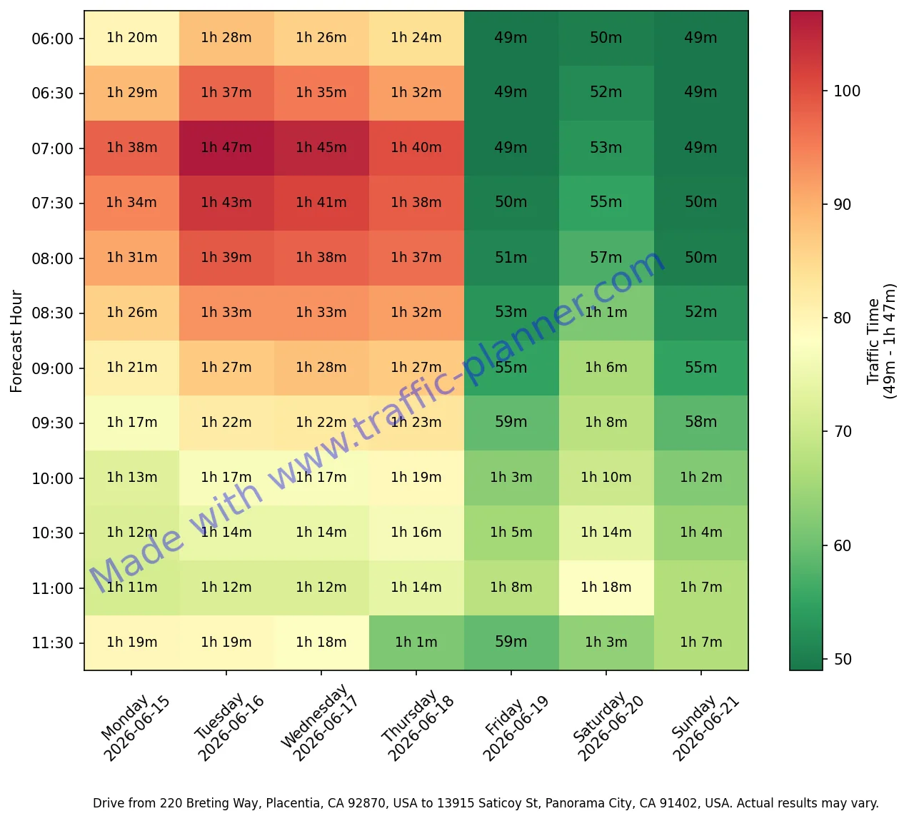
Each column is one day — Monday through Sunday — with the calendar date shown below the day name. This route covers the next full 7-day window from your analysis date.
Each row is a 30-minute departure window, from 6:00 AM at the top to 8:00 PM at the bottom. The number in each cell is the predicted drive time in minutes for that slot.
Colors are scaled to your route's actual data range — green is the fastest time recorded, red is the slowest. A green cell on a long route still reflects a long trip; the scale shows relative congestion, not absolute speed.
What the Colors Mean
The color scale is relative to your specific route, not a universal speed scale. A green cell on a 90-mile route means that trip is fast for that route — it will still take longer than a red cell on a 5-mile route. What matters is the difference between green and red on the same heatmap: that gap shows you how much time you can save by shifting your departure.
On the LA example above, the difference between the fastest and slowest cells is nearly an hour — meaning the same 47-mile commute takes 49 minutes at the best time and 1 hour 47 minutes at the worst. The heatmap shows you exactly where those boundaries are.
How to Read Your Heatmap in 5 Steps
Find your target day column
Each column header shows the day of the week and the calendar date. Locate the column for the day you're planning to drive.
Look at the color gradient in that column
Scan the column top to bottom. You'll see a pattern — typically light (green) in early morning, darkening through the rush window, easing back midday, then red again in the evening peak.
Find the greenest cell in your target window
If you need to leave between 7 AM and 9 AM, find the greenest row in that range within your column. That's your optimal departure time for the day.
Compare across days
Look at the same row across all columns. You can see which days are consistently worse (often Monday and Friday) vs. which days have lighter traffic at the same hour.
Check the number in the cell
The drive time printed in each cell tells you the exact predicted duration. Use this to decide whether shifting by 30–60 minutes is worth the time saved on your specific route.
Generate a Heatmap for Your Route
Enter any origin and destination to get a 7-day heatmap like the one above — specific to your commute, not a city average.
route Analyze My RouteHeatmap FAQ
How accurate is the traffic prediction?
The heatmap is built from Google Maps Distance Matrix data pulled at the time of your submission. It reflects Google's traffic prediction model for each specific time slot — the same engine that powers Google Maps ETAs. Predictions are generally reliable for typical weekday patterns; they are less accurate for routes affected by one-time events, weather, or construction not yet in the data.
Why does the color scale look different from other heatmaps?
The color scale is normalized to your route's own data range, not a fixed speed scale. This means the full green-to-red spectrum always spans from your route's fastest to slowest observed time. A route that never truly clears will still show green at its best relative window — the scale shows congestion variation, not absolute travel speed.
What time range does the heatmap cover?
Each heatmap covers 30-minute slots from 6:00 AM to 8:00 PM across 7 consecutive days starting from the upcoming Monday. The analysis always looks forward from your submission date — it does not include historical data or past traffic.
Can I generate a heatmap for any route?
Yes. Traffic-Planner.com works for any origin and destination within the United States. The tool uses Google's Places Autocomplete to resolve addresses, so you can enter intersections, landmarks, ZIP codes, or full street addresses. Results may vary for rural routes with limited traffic signal data.
Why are weekends sometimes greener than weekdays?
Weekend traffic patterns differ significantly from weekday commute patterns on most routes. Commuter corridors that carry heavy weekday volume often run at 40–60% of that load on Saturdays and Sundays, resulting in noticeably shorter drive times — which show up as green cells in the weekend columns.